A new homepage for the Pfadi Kanton Schwyz
The Pfadi Kanton Schwyz is the umbrella organization of all scout divisions in the Canton Schwyz. It is the link between the scout divisions and the Swiss Guide and Scout Movement. The Pfadi Kanton Schwyz wanted to modernize their web presence, so they asked me to help them out.
The whole project had a rough start. We started all the way back in September 2017. The Pfadi Kanton Schwyz had updated their logo and with it their homepage not too long ago. The problem with the website was that even though it had a fresh design, the user experience was a bit lacking. In September 2017, I had freshly finished my summer examinations at ETH Zurich and didn't have much to do so I started to work on a redesign of the website. At the time, I didn't know much about web design. I just started to play around with web design and web development the previous year. So instead of making mock-ups, as I do now, I directly started with HTML and CSS. After a few weeks, I had a prototype. I wasn't asked to do it, but I had some friends in the Pfadi Kanton Schwyz so I showed them my prototype. I received really good feedback for it and not long after they asked me to do it officially, and I agreed.
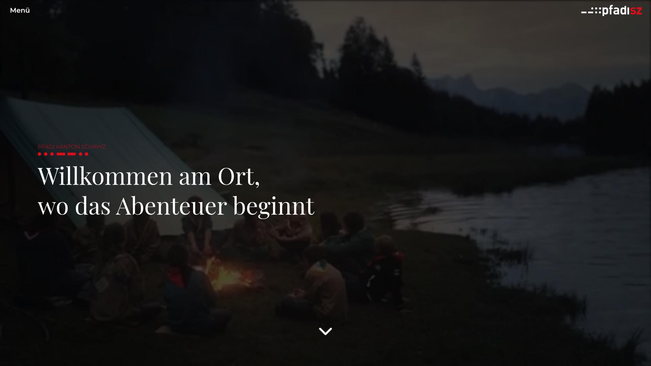
The whole project went through several major redesigns. It ended up looking completely different than the original prototype. The original prototype was inspired by newspaper websites, this is also why I used serif-fonts for titles. It also had a video playing in the background in the hero of the landing page. The overall primary colors were red, white, and black. Those colors were the only thing consistent through all designs. The original prototype had some major improvements to the website the Pfadi Kanton Schwyz was using at the time, but also introduced a lot of other issues. Just the loading time alone was a significant issue. Other than that, only the landing page had a well-thought-out design all other pages used the same design, which made the overall website boring and repetitive.

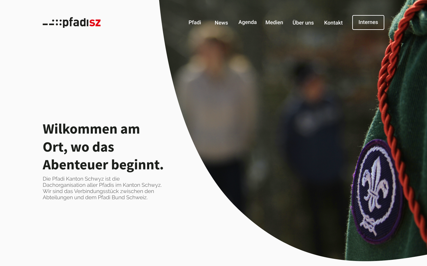
Over the time span of a year, I only made small adjustments to the original prototype but neither they nor I were really happy. So, in summer 2018, I decided to scrap the whole design and start from scratch. Over time I had learned a lot about web design and user experience. I also got familiar with Figma, so this time I started with mock-ups instead of a HTML prototype. This time I additionally introduce a bright green, orange, and cyan to the design. The overall design was light with four colors sprinkled here and there.

For the website, I used Grav CMS as the back-end. It was only the third website where I used Grav CMS so I still had to familiarize myself with Twig etc. and the whole development process progressed quite slowly. In July 2019, I had finally finished the project after almost two years. The final website can be found under pfadisz.ch.
This website was my first website of this scale which I designed and developed by myself. I luckily had many friends which supported me during the whole process and gave regular feedback. It was really one of the major stepping-stones for my career.
Many thanks to the Pfadi Kanton Schwyz for giving me this opportunity!