A new homepage for the VIS Kontaktparty
The VIS Kontaktparty, or just Kontaktparty for short, is the largest academic IT recruiting fair in Switzerland. Inspired by my old portfolio website, which had a moving network as its background, the team of the Kontaktparty asked me if I would be interested in implementing this said network on the homepage of the Kontaktparty. Since at the time the website was already a few years old, we decided to not only add the network but to redo the homepage as a whole.
The Kontaktparty does not have an official brand guide but over the years they established a consistent branding for their event booklet. The website at the time looked completely different to the booklet and felt a bit out of place. Since the Kontaktparty is the largest event of the VIS (Verein der Informatik Studierenden an der ETH Zürich) its website is one of the most frequently visited places for companies in the VIS. This also means it’s an important poster child of the VIS.
Originally, the team of the Kontaktparty asked me to just add the moving network of my old portfolio website as the background in the top. I published the source code of which on GitHub. But later we changed that to a complete overhaul of the website.
As usual I started with a new Figma Draft. The website had only three subpages. The first a switching screen, which redirects students and companies to their respective page. The students' part is hosted on the VIS website, so there was no need for a design there. The company's part on the other hand had two subpages at the time. The landing page has all the information for the companies interested to participate at the Kontaktparty. The team page introduced the team behind the Kontaktparty.
As I was working with the logo of the Kontaktparty I realized first of all that there was no real Kontaktparty logo but only a logo for the Kontaktparty Committee. The Kontaktparty was only using the icon (the spiral) of said logo. So I asked them if I should also create a logo-set and mini-guideline for the Kontaktparty and they agreed. But as I looked closer at the spiral, there was something off. I should have been rotation-symmetrical with clear lines. Not only was it not rotation-symmetrical but the lines where lines were wobbly, which was especially obvious in the center with the triangles. I told them that, and it seems no one has realized so far that the original vector file was long lost. So I had to recreate the spiral anew.

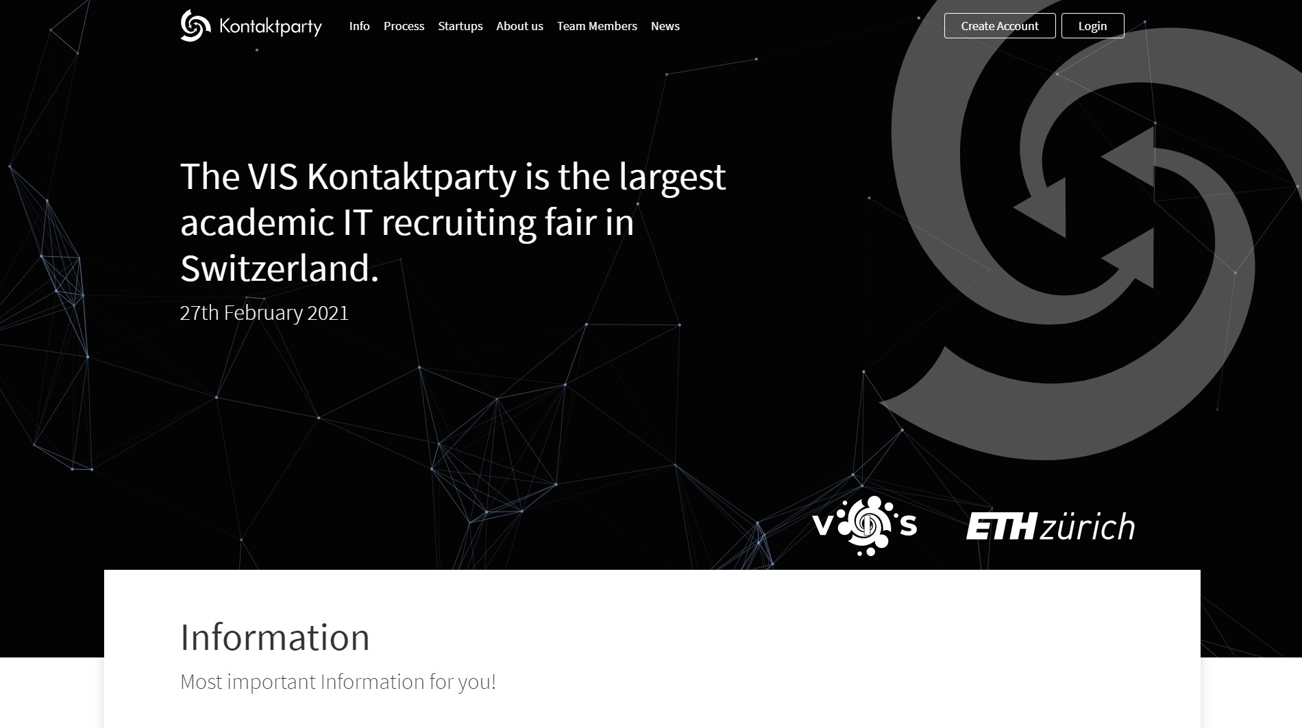
The overall design is very simple and closely related to the booklet design. The hero of the page has a very dark blue background with the moving network on it plus the Kontaktparty spiral with a low opacity. The rest of the website is mostly black and white with a few sprinkles of the Kontaktparty-Blue as a highlight color. I followed the desktop-first approach for the design. This sounds counter-intuitive nowadays since most users are on mobile devices, but it made sense for this website. The reason was most users of the website are company employees, which mainly use desktop computers for their work. So I wanted to make it look best on the desktop. But thanks to its simple design it was really easy to make the website responsive.

The implementation part for the design was pretty straight forward, and I only had to make minor changes to the overall design. The harder part was the back-end. So far the Kontaktparty used a simple PHP script in the back. I could have just implemented it similarly but I thought I can make it a bit more user friendly and scalable. I ended up creating a basic CMS with Twig templates. As a result the content can be simply written in Markdown and Kontaktparty team does not need to have a lot of knowledge to update the website.
The final website of the Kontaktparty can be found under kontaktparty.ethz.ch.