Building a Community Platform for Education from Scratch
The idea behind TigerJython Community was to build a platform which serves as an information hub for TigerJython related products and also has a community area where students can share their projects, and have discussions of new ideas.
My Bachelor's Thesis' project was mostly focused on the technical aspects of the platform. Most of the design work was not part of the requirements and I just did it for fun. In this article, I will only talk about the design part of the whole project. If you are interested in the technical part as well, I have attached my Bachelor's Thesis below. Before I start, I want to add a small disclaimer. Bear in mind, that the branding created in this process is not the official brand guide of TigerJython (a brand from TJ Group). It was just a fun side project next to the Bachelor's Thesis. Also, I will continue the article in the third person plural even though it was all done by myself, since the thesis is written in this form as well. Now, let's get started.
At the start of the project, we mostly spent time gathering information of competing platforms and analyzing this information. In addition to this information, we defined suitable personas of our target audience(s). With which we created a requirements file that not only covered the functionality of the platform, but also requirements for the user interface.
TigerJython Community has two quite different user personas. First, there are the users using the community area, which are generally in
the range of ages 12 to 18. The other are the users who make use of TigerJython Community as an information hub of all
TigerJython related products. Those users are mostly parents or educational personal such as teachers. So we had to create a
user experience and find a visual language which can cover those audiences well in both visual design and user experience. This actually
turned out to be quite challenging, especially on mobile devices.
Zuerst mussten wir ein klares Verständnis für die Marke selbst bekommen. TigerJython Produkte hatten bisher ein etwas veraltete Designsprache. Einem kompletten Rebranding von TigerJython selbst stand also nicht viel im Wege. Wir haben das Thema Tiger und Dschungel gewählt, basierend auf dem Markennamen. Neben dem Logo und kleineren Designelementen haben wir auch ein Maskottchen entworfen. Das Maskottchen ist ein Tiger als Teenager, um das allgemeine Alter der Benutzer von TigerJython nachempfinden zu können. Der vollständige Marken-Guide, der in diesem Prozess erstellt wurde, ist unten beigefügt.

A big part of the thesis was analyzing and organizing all the content of the platform. For this we first created a rough structure of all the subpages and how they are connected. This way we could already sort the contend roughly and could concentrate better on details of each part of the platform. Based on the information architecture we then created user flows to analyze the possible paths a user could take when navigating through the system. I have attached the complete user flow study below, if you are interested. After organizing all the content and analyzing the user flows, we proceeded with creating a user interface.
The user interface was a bit of challenge, since it had to be interesting for children/young adults between age 12 to 18, but also for parents and teachers. So it had to be a clean and modern design with a bit of playfulness to be attractive for the younger audience but also not too much such that it can still be taken serious by educational personal.
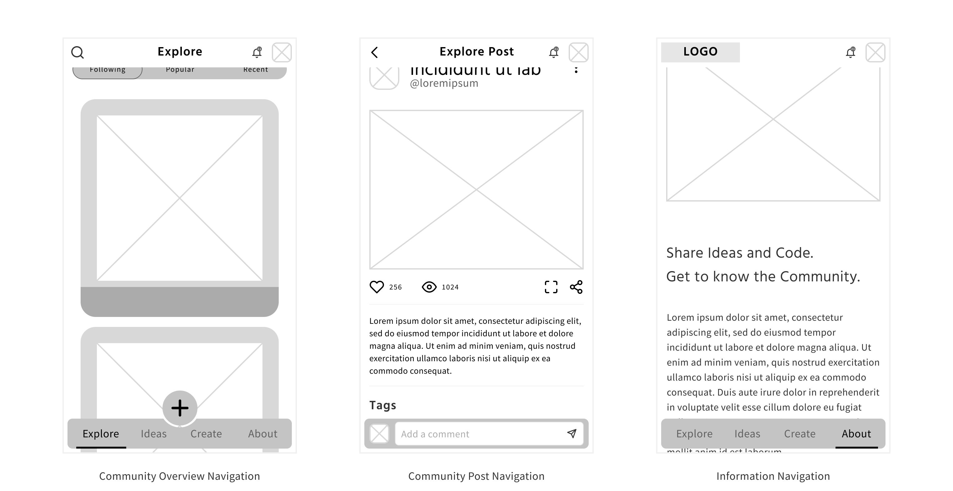
With the user interface we followed the mobile first approach. This is because today the larger part of the Internet users are on mobile devices, and this is especially true for main user group, the students, of this platform. We started with wireframing all the different parts of the platform. Hereby we already created Hi-Fi prototypes with the wireframes to make sure we had an easily understandable user interface and a good user experience early on. The main challenge with the user interface was the different needs for the two parts of the platform. The information hub and the community platform have two quite different needs in usability. The community platform has to be inviting to the user to share and explore, whereas the static parts have to provide the sought information. So we decided to have different menus and navigation for those two parts.

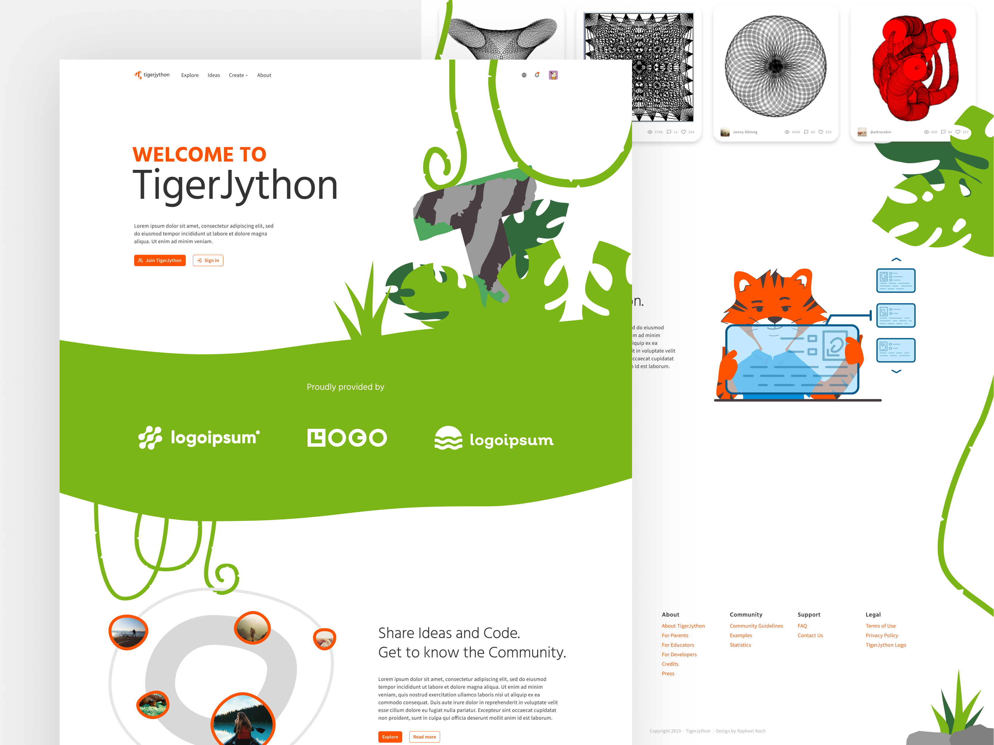
After we had all the wireframes, we proceeded with the mock-ups. We tried to emphasize the mentioned visual language, with a mix of bright colors, white background, and some jungle themed elements here and there. Overall the design should look clean and modern, but we spiced it up a little with some jungle elements and our mascot, the tiger. Since we had the break in the navigation style between the two part of the platform we tried to connect them with design. So we tried to find a consistent usage of the colors and design elements between all the pages to create a consistent feel.
