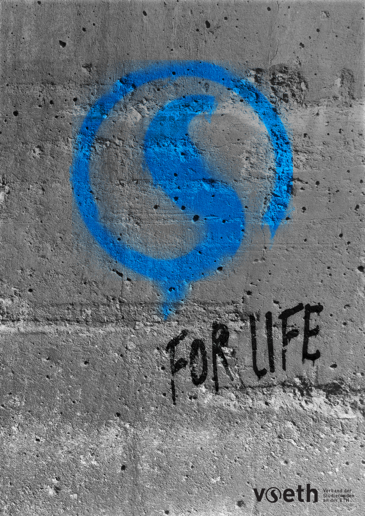
Renewal and redefining of the VSETH CI
The VSETH did a rebranding back in 2016, which also included new branding guidelines. Later in 2018 I helped develop a more consistent design language for the web, which then led to this project. Originally, it was thought to be just a combining of the Print CI from 2016 and the Web CI, but it ended up as a complete overhaul of the VSETH CI.
The VSETH or in its full name "Verband der Studierenden an der ETH" is the umbrella organization of all students at ETH Zurich. Back in 2016, the VSETH decided to make a complete rebranding, which also included the creation of a new logo-set. The goal was not only to modernize the VSETH logo but also to create a completely new visual identity for the VSETH.
In 2018, I was asked by the VSETH IT, now renamed to Student Innovation Platform, to help them create a Web CI. They were developing quite a few different websites and web-apps but all those projects lacked consistency. So my job was to design components and write the CSS for them. The CSS was then used to create React components, which formed the VSETH Frontend Framework. The idea was that with the help of the framework the creation of front-ends is as straightforward as possible, such that the Web CI will be used naturally.
Now the VSETH had a Web CI and they had the Print CI from 2016. The next step was to combine and renew the guidelines. Since I had already created the Web CI and because of my familiarity with the Print CI of the VSETH, they asked me for this job.
The initial idea was for me to simply write a combined guideline of those to CIs, with small adjustments to the Print CI. But as I started to work on it I soon realized that the Print CI had quite a few things missing or lacked an easily applicable definition. So instead of simply writing a combined guideline, it ended up as a complete overhaul of the VSETH CI. I redefined the spacings and clear space of the logos, made clear definitions of different documents, added guidelines for illustrations and photography, and so on.

Since I had already started to overhaul the VSETH CI, members of the VSETH also started to make clearer definitions of how and where the guidelines apply. They defined for each sub-organization of the VSETH which part they had to comply with and which they have free choice over. Then we opened up the feedback pool to all members of the VSETH. Based on the feedback we added parts like creative freedom to the CI, to open up the usage of the logo for creative work such as posters.

All the content we added obviously ended up with a massive document. The branding guidelines ended up with over 80 pages. Since most people, who use the guidelines, will only need a small part of the guidelines for their work, I decided to create a cheat sheet. This cheat sheet just contains to most important parts of the guidelines for a quick overview.